
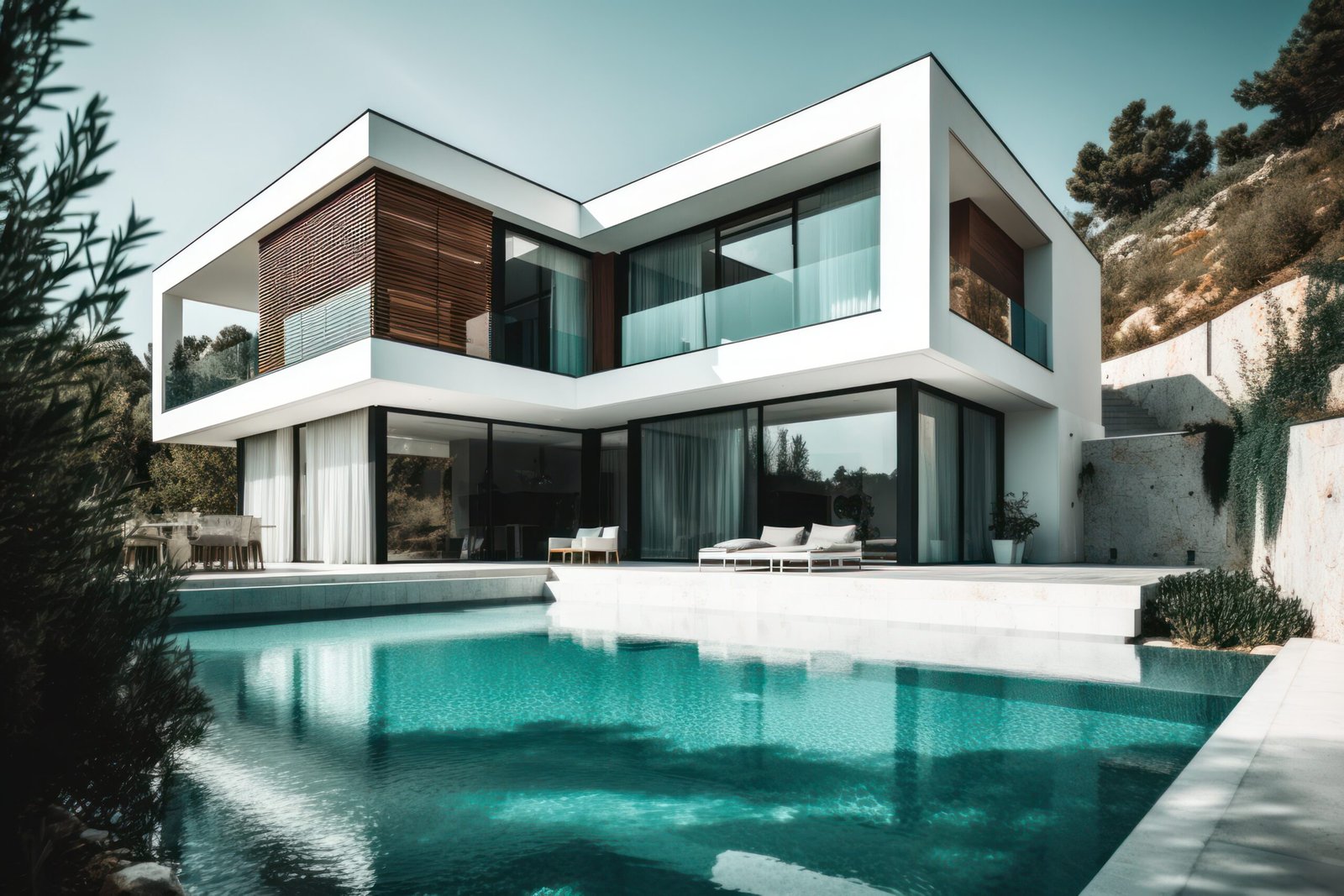
Drive through any Indian neighbourhood, from a gated layout in Coimbatore to an independent house in a Tier-2 town, and you’ll notice something. Two houses can be the exact same size, built with the same budget, and yet one looks like it belongs to a builder catalogue while the other looks like it belongs on a design magazine cover. Nine times out of ten, the difference isn’t the compound wall or the gate design. It’s the paint.
Colour is the cheapest, fastest lever you have for changing how expensive a house reads from the road. A well-chosen exterior palette can do more for your home’s first impression than an expensive façade renovation, provided you pick shades that actually suit Indian light, Indian heat, and Indian dust. After working alongside architects and interior designers who’ve watched hundreds of homes go from plain to premium, one thing becomes obvious: it’s rarely about the “prettiest” colour. It’s about the colour that looks intentional.
Here’s what genuinely works for Indian homes in 2026.
1. Warm Off-White and Ivory
Pure white always looks clean on day one, but Indian dust, humidity, and pollution show every stain within a season. That’s why designers now lean towards warm off-whites and ivory tones instead, shades with a hint of cream or beige in them, rather than a stark, cold white.
This works for two reasons. First, it hides dust and water marks far better than bright white. Second, it makes columns, jaalis, and window grilles stand out in contrast, which is exactly what gives a façade that “designed” look rather than a “just painted” look. Pair an ivory body with a charcoal or deep brown window frame and you get the kind of crisp contrast seen on well-finished independent houses and villas across Tamil Nadu and Kerala.
2. Warm Grey and Elegant Grey Tones
Flat, cool grey can look institutional under harsh Indian sunlight, almost like an unfinished commercial building. What’s replacing it is warm grey, sometimes called “elegant grey” in Indian paint catalogues, that leans slightly beige or taupe rather than blue.
Warm grey has become a favourite for modern independent houses and villas in cities like Bangalore, Coimbatore, and Pune because it photographs well, ages gracefully, and doesn’t compete with landscaping or stone cladding. It’s the exterior equivalent of a well-stitched linen shirt: understated, versatile, and unlikely to look dated in five years.
3. Terracotta and Warm Earth Tones
Terracotta deserves special mention because it’s uniquely suited to India. It’s warm, it’s rooted in traditional Indian architecture, and it pairs beautifully with red-oxide flooring, exposed brick, and wooden pergolas, materials that are already common in Indian homes.
A terracotta accent on columns, parapets, or a single feature wall against an off-white or beige body creates a look that feels premium without feeling imported. It’s a favourite for traditional bungalows and farmhouses, and it works particularly well for homes with a lot of natural stone or wood detailing.
4. Deep Charcoal and Near-Black Accents
If lighter neutrals are the safe, expensive choice, charcoal and near-black are the bold one. Used as an accent, on the main door, window frames, a boundary wall, or a single feature panel, dark tones create the kind of sharp contrast that makes even a simple elevation look architecturally considered.
The catch is maintenance. Dark shades show dust streaks and water stains more visibly during monsoon, so they work best on covered or sheltered surfaces, and only on a home where the rest of the façade, landscaping, and boundary wall are well kept. On a neglected exterior, dark paint just draws attention to what’s not maintained.
5. Muted Teal and Deep Green
Teal and deep green have quietly become a signature of modern Indian architecture, especially on accent walls, gates, and grilles. Unlike bright green, these deeper, dustier shades feel grounded rather than loud, and they work especially well against white or beige backgrounds with visible greenery around the compound.
This combination is increasingly common on newer villas and independent houses, precisely because it signals that someone thought about the palette as a whole, not just picked “a nice colour” off a shade card.
The Real Secret: Contrast, Not Just Colour
Here’s what most colour guides skip. No single shade makes a house look expensive on its own. What actually creates the effect is contrast between the body colour, the trim, and the accents, columns, window frames, grilles, and the main door.
A light neutral body with a dark trim (or a dark body with crisp white trim) creates depth and draws the eye to architectural details instead of letting the wall read as one flat surface. A monochrome façade with no contrast, however nice the colour, tends to look plain rather than premium. The simplest formula: one dominant neutral for the body, one contrasting shade for the trim and grilles, and, if you want a small pop of character, one accent colour reserved for the main door alone.
What to Avoid
A few habits consistently make Indian home exteriors look cheaper, no matter the quality of paint used:
- Overly bright, saturated colours on large wall areas (neon pinks, bright blues) tend to look like a shop-front rather than a home.
- Cold, flat greys with no warmth can feel closer to an under-construction building than a finished residence.
- Skipping waterproofing-grade exterior paint to save cost. In India’s monsoon and heat cycles, ordinary interior-grade paint peels and fades fast, and nothing looks less expensive than a façade that’s blistering after one rainy season.
- Ignoring your home’s orientation. South and west-facing walls in India take intense heat and glare; darker colours here fade faster and absorb more heat, so they need higher-grade, heat-reflective exterior paint to hold up.
Test Before You Commit
Before repainting the whole house, get sample pots from a trusted brand and paint large swatches directly on the actual wall, ideally on the sides that get the most sun as well as a shaded corner. Indian daylight is intense, and a shade that looks elegant on a colour card can look completely different against real sunlight, red-oxide flooring, or granite cladding. Live with the sample for a few days across morning and evening light before you commit to gallons of paint.
Beyond Paint: Colour Is Only Part of the Design
Paint colour can transform how a house is perceived, but it works best when it’s chosen as part of the overall architectural and interior plan, not as an afterthought once construction is done. The proportion of glass, the choice of cladding, the design of the compound wall, and the interiors visible through the windows all work together with your exterior colour to create that “expensive” first impression.
If you’re planning a new home or considering a façade upgrade, it helps to involve your residential architecture team early, so that colour, materials, and elevation design are planned together rather than patched in later. And if you’re already building or renovating, our residential construction and residential interior design teams at Shayon Home Creation can help make sure the inside of your home feels as premium as the outside looks.
Frequently Asked Questions
Which colour makes a small house look bigger and more expensive?
Light, warm neutrals like ivory, warm white, or a soft beige reflect more light and make a small façade feel more open. Keep the trim in a single contrasting shade rather than multiple accent colours, since too many colours on a small elevation tends to make it look busier and smaller, not bigger.
Is white or off-white better for Indian homes?
Off-white and ivory are usually the better choice over pure white. Pure white shows dust, water stains, and pollution marks far faster in Indian conditions, especially in cities with heavy traffic or coastal humidity. A warm off-white gives the same clean, premium look while hiding grime for longer between repaints.
Which exterior paint colours last longest in Indian weather?
Mid-tone neutrals like warm grey, beige, and terracotta tend to hold their colour better than either very dark or very bright shades, since dark colours fade and absorb heat under direct sun, while bright saturated colours lose vibrancy faster under UV exposure. Always pair the colour with a genuine exterior-grade, weatherproof paint rather than an interior-grade one.
Does the colour of the front door really make a difference?
Yes. The main door is one of the few places where a bold colour, deep charcoal, forest green, or a rich wood stain, adds character without overwhelming the façade. It’s the detail most visitors notice first, so it’s worth spending a little more on a good quality finish here even on a modest budget.
Should south- or west-facing walls avoid dark colours?
It’s not that you must avoid dark colours entirely, but south- and west-facing walls take the most direct heat in India, so dark shades here fade faster and heat up more. If you want a darker tone on these walls, use a heat-reflective or UV-resistant exterior paint rated for high sun exposure, and consider saving very dark colours for sheltered or shaded sections instead.
How often should an exterior wall be repainted to keep the “expensive” look?
Most quality exterior paints in Indian conditions hold up well for 5 to 7 years before touch-ups are needed, though homes exposed to heavy monsoon rain or coastal salt air may need attention sooner. Regular washing and prompt repair of cracks or dampness patches matters as much as the paint quality itself in keeping the façade looking fresh.
Can I get help choosing the right exterior colour for my home?
Yes. Colour looks different on every façade depending on orientation, surrounding buildings, and materials like stone or wood cladding, so what works on a colour card or a neighbour’s house may not suit yours.Talk to our design team for a consultation that considers your home’s architecture, lighting, and materials together.
Curious what a design-led approach could do for your home? Get in touch with us for a free consultation, or browse more ideas on our blog.
Tags: house color